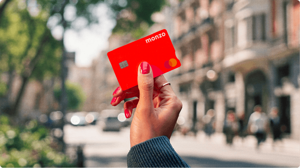
Monzo's hot coral card was designed by accident. Hugo Cornejo, then at the company when it was still called Mondo, looked down at his Nike trainers and proposed the colour under deadline pressure. What followed was not planned: the card became a word-of-mouth engine at ticket barriers and pub counters, contributing materially to Monzo's growth to 15 million customers. Starling followed with vivid teal in 2018, then doubled down with a September 2025 rebrand that intensified the hue and dropped 'Bank' from the name entirely. One designer's shortcut is now a category playbook.
The security question is more complicated than the obvious framing. Ben Vollaard at Tilburg University tracked Dutch car theft data from 2004 to 2008 and found brightly coloured cars were stolen at roughly 40% lower rates than black, white, and silver ones. None of the 109 pink cars in his dataset were taken. The mechanism was resale value, not visibility. A neon card does not map perfectly onto a car, but the logic holds: conspicuousness can deter rather than invite. The stronger counterpoint comes from the 2019 University of Michigan wallet study, where Alain Cohn and colleagues dropped more than 17,000 wallets across 40 countries and found that wallets with more cash were returned at higher rates in 38 of those countries. Civic honesty, not object visibility, drove recovery rates.
The piece is worth reading in full not for its conclusion but for the friction between its evidence sets. The Dutch car theft data, the wallet experiment, the psychology of payment pain, and the failed Monzo colour trademark application are all in here, and they do not resolve neatly. The author is honest about where the research thins out and where folk wisdom is masquerading as analysis. That intellectual honesty is rarer than it should be in writing about design decisions.
[READ ORIGINAL →]